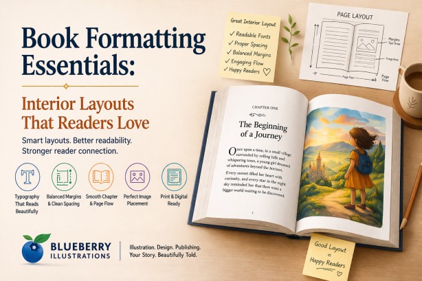
Introduction to Book Formatting and Interior Design
Book formatting is what turns a manuscript into a readable, professional book. It defines how text, spacing, images, and chapters are structured on each page, directly affecting how easily readers can follow and enjoy your content. Whether you plan to publish book on Amazon, work with an amazon self publishing company, or explore amazon publishing independently, understanding formatting basics helps you avoid common mistakes and create a book that meets industry standards.
From typography and margins to image placement in book illustrations, every detail plays a role in readability and presentation. This guide breaks down the essential elements of interior layout so you can create a book that looks polished, reads smoothly, and delivers a better experience to your audience.
Why Interior Layout Matters in Book Publishing
Readers may not consciously analyze formatting, but they immediately feel when something is wrong. Poor layout creates friction, while a well-designed interior feels invisible and natural.
- Improves readability and reduces eye strain
- Enhances storytelling flow and pacing
- Builds trust and credibility for first-time authors
- Increases the perceived value of your book
- Reduces negative reviews related to formatting issues
- Supports better comprehension, especially in children’s books
- Creates consistency across print and digital formats
- Helps maintain reader engagement across chapters
- Ensures professional presentation for publishing platforms
- Strengthens the impact of book illustrations through proper placement
- Improves navigation and structure in longer books
Top book illustration companies, illustration firms, and illustration studios treat layout as seriously as visuals because both work together to shape the reader’s experience.
Understanding the Basics of Book Formatting
Book formatting is not just about making a manuscript “look good.” It directly affects readability, reader engagement, and how professional your book feels. Every detail—from page size to paragraph spacing—plays a role in how smoothly a reader moves through your content.
Whether you are using professional book publishing services or formatting your manuscript yourself, understanding these core elements will help you avoid common mistakes that can make a book feel amateurish.
-
Trim size and page dimensions define the physical size of your book, such as 5”x8” or 8.5”x11”. The right size depends on your genre—children’s books, novels, and workbooks all follow different standards. Choosing the wrong trim size can impact printing cost, readability, and even bookstore acceptance.
-
Margins and gutter spacing ensure that your content has enough breathing space. The gutter, or inner margin, is especially important in printed books because it prevents text from being lost in the binding. Poor spacing can make pages feel cramped and difficult to read.
-
Typography and font hierarchy control how your text is presented. This includes font choice, size, and consistency across headings and body text. A clear hierarchy helps guide the reader, while poor font choices can reduce readability and make the book look unprofessional.
-
Line spacing and paragraph alignment directly affect reading comfort. Proper spacing reduces eye strain, while alignment choices like justified or left-aligned text influence the overall appearance and flow of the content.
-
Chapter structure and pagination create a consistent reading experience. Elements such as chapter openings, spacing, and page numbering should follow a uniform style to maintain a smooth and professional flow throughout the book.
-
Image placement and bleed settings are critical for illustrated and children’s books. Bleed ensures that images extend to the edge of the page without leaving unwanted white borders after trimming. Incorrect settings can lead to printing errors and poorly aligned visuals.
-
Widows, orphans, and text flow are small details that significantly impact visual balance. These refer to single lines of text left at the top or bottom of a page, which can disrupt readability if not handled properly.
-
Consistency across the entire book ensures a polished and professional result. Uniform spacing, fonts, and layout styles help build trust with readers and improve the overall reading experience.
Professional book editing services and formatting experts ensure that all these elements work together seamlessly. This is especially important when preparing files for both print and digital platforms like Kindle, where formatting requirements can differ significantly.
Choosing the Right Trim Size and Page Dimensions
Trim size is one of the most important decisions in book formatting because it defines the final width and height of your book after printing. It directly affects readability, visual appeal, printing cost, and how your book is perceived by readers. A poorly chosen size can make even well-written content feel unprofessional or uncomfortable to read.
The right trim size should match your book’s genre, target audience, and content structure. Industry-standard sizes exist for a reason—they align with reader expectations and production efficiency, helping your book feel familiar and professionally produced. :contentReference[oaicite:0]{index=0}
-
Children’s books usually use larger or square formats such as 8”x10” or 8.5”x8.5”. These sizes provide more space for illustrations, allowing visuals and text to work together effectively. Larger pages also make it easier for young readers to engage with the story. :contentReference[oaicite:1]{index=1}
-
Novels and fiction books typically follow standard sizes like 5”x8”, 5.5”x8.5”, or 6”x9”. These formats are widely accepted in the publishing industry because they balance readability, portability, and printing cost. :contentReference[oaicite:2]{index=2}
-
Non-fiction books have more flexibility in size depending on the type of content. Text-heavy books often use 6”x9”, while workbooks, manuals, or visually rich content may require larger formats like 8.5”x11” to provide enough space for diagrams and layouts. :contentReference[oaicite:3]{index=3}
-
Printing cost is directly influenced by trim size. Larger books require more paper and ink, increasing production expenses, while smaller sizes are more cost-efficient but may limit layout flexibility. :contentReference[oaicite:4]{index=4}
-
Reader experience also changes with size. Smaller books feel compact and easy to handle, while larger books appear more premium and visually engaging, especially for illustrated content. :contentReference[oaicite:5]{index=5}
If you are creating a picture book or learning how to publish children's story books, larger trim sizes allow illustrations to breathe and significantly improve engagement. Choosing the right dimensions ensures that both text and visuals are balanced, creating a smoother and more immersive reading experience.
For a detailed breakdown of standard sizes, formats, and how to choose the best option for your book, read this article:
children’s book trim size guide.
Typography Essentials: Fonts That Enhance Readability
Typography is not just about choosing a “nice-looking” font—it directly controls how easily your content can be read and understood. Good typography becomes invisible to the reader, allowing them to focus entirely on the story, while poor typography creates friction, distraction, and fatigue.
Every decision, from font style to spacing and hierarchy, should be made based on your audience, genre, and reading environment. A well-formatted book uses typography to guide the reader naturally from one line to the next without effort.
-
Serif fonts are commonly used in novels and long-form non-fiction because the small strokes at the ends of letters help guide the eye across lines of text. This makes extended reading more comfortable, especially in printed books.
-
Sans-serif fonts are often used in children’s books, educational content, and modern layouts because they appear cleaner and simpler. For younger readers, these fonts improve letter recognition and readability.
-
Font size plays a crucial role in readability. If the text is too small, it strains the eyes; if it is too large, it disrupts reading flow and increases page count unnecessarily. Different genres follow different size standards to balance comfort and cost.
-
Line spacing, also known as leading, determines how tightly or loosely text lines are stacked. Proper spacing prevents lines from blending together and allows the reader’s eyes to move smoothly across the page.
-
Font hierarchy helps organize content by clearly distinguishing headings, subheadings, and body text. Without a clear hierarchy, readers struggle to navigate the structure of the book, especially in non-fiction or educational content.
-
Letter spacing and word spacing must be carefully controlled to avoid awkward gaps or crowded text. Poor spacing is a common issue in self-formatted books and can make pages look uneven and unprofessional.
-
Decorative or stylized fonts should be used sparingly, typically only for titles or headings. Using them in body text reduces readability and distracts from the content.
-
Consistency across the entire book is essential. Changing fonts or spacing styles randomly can break immersion and reduce the overall quality of the reading experience.
Experienced book publishing service providers carefully refine typography based on the target audience and format, ensuring that the text remains clear, balanced, and easy to read across both print and digital versions.
Margins, Spacing, and Alignment: Creating a Clean Layout
Margins, spacing, and alignment are the invisible structure of a book. While readers may not consciously notice them, they immediately feel when something is off. Poor layout creates visual clutter, makes reading tiring, and reduces the perceived quality of the book.
A clean and well-balanced layout ensures that text flows naturally, pages feel open and readable, and the overall design looks professional and consistent from beginning to end.
-
Inner margins, also known as the gutter, must be wide enough to account for binding. If the gutter is too small, text can disappear into the spine, making it difficult to read without forcing the book open.
-
Outer margins provide breathing space around the text. Proper margins prevent pages from feeling cramped and make the content more visually inviting.
-
Line spacing and paragraph spacing work together to create rhythm in the text. Consistent spacing helps readers move smoothly through paragraphs without confusion or visual interruption.
-
Paragraph indentation or spacing between paragraphs should be used consistently throughout the book. Mixing styles can make the layout look unstructured and confusing.
-
White space is a key design element, not wasted space. It improves readability, reduces cognitive load, and gives the reader’s eyes a place to rest between sections.
-
Text alignment, whether justified or left-aligned, affects both readability and appearance. Justified text creates clean edges but requires careful spacing control, while left-aligned text feels more natural and is easier to manage in digital formats.
-
Widows and orphans—single lines left at the top or bottom of a page—should be avoided. These small issues can disrupt the visual flow and make pages feel unbalanced.
-
Consistent layout across all pages builds trust and professionalism. Even small inconsistencies in spacing or alignment can make a book feel poorly designed.
This level of precision is one of the main reasons many authors choose a professional book publishing company instead of relying on automated tools, especially when preparing books for both print and digital platforms.
Structuring Chapters and Page Flow Effectively
Chapter structure is not just about dividing content—it directly controls pacing, readability, and how readers emotionally experience your book. A well-structured layout guides the reader smoothly from one section to the next, while poor structure creates confusion, breaks immersion, and disrupts the flow of the story.
Effective page flow ensures that readers never feel lost or interrupted. Each chapter should feel like a natural continuation of the previous one, with clear visual cues that signal transitions without being distracting.
-
Starting each chapter on a new page is a standard publishing practice that gives the reader a clear mental break between sections. In printed books, chapters often begin on the right-hand page to maintain a professional structure.
-
Consistent heading styles help readers instantly recognize chapter titles and section breaks. This includes font size, spacing, alignment, and placement, all of which should remain uniform throughout the book.
-
Spacing before and after chapter titles creates visual separation from the body text. Proper spacing ensures that headings stand out without feeling disconnected from the content that follows.
-
Opening paragraphs of chapters should be carefully positioned to create a smooth entry into the content. Poor placement or awkward spacing can make the start of a chapter feel abrupt or visually unbalanced.
-
Page breaks should be planned to avoid disrupting sentences or leaving excessive blank space. Poorly placed breaks can interrupt reading flow and reduce engagement.
-
Transitions between chapters should feel natural and intentional. Whether it is a continuation of the storyline or a shift in topic, the structure should support a seamless reading experience.
-
Inconsistent chapter layouts can confuse readers and reduce the overall quality of the book. Maintaining uniform structure across all chapters builds trust and professionalism.
-
Special elements such as drop caps, decorative dividers, or opening illustrations can enhance chapter beginnings when used thoughtfully, especially in children’s books and illustrated content.
This becomes especially important when learning how to publish a children's novel, where pacing, clarity, and visual structure directly influence how easily young readers can follow and enjoy the story.
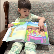
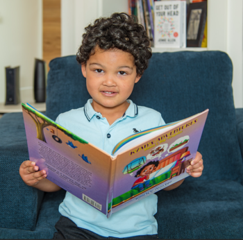
Image Placement and Visual Balance in Illustrated Books
In illustrated books, layout is not just about placing images next to text—it is about creating a visual storytelling experience where both elements work together seamlessly. Poor image placement can confuse readers, disrupt pacing, and weaken the impact of the story.
A well-balanced layout ensures that illustrations guide the reader’s attention, support the narrative, and enhance emotional engagement without overwhelming the page.
-
Illustrations should be aligned with the flow of the text so that readers naturally connect the image with the corresponding part of the story. Misaligned visuals can create confusion and break immersion.
-
Each page should maintain a balance between text and visuals. Overcrowding a page with too many images or too much text can make it feel cluttered and difficult to follow.
-
White space around illustrations is essential. It helps separate visual elements from text, improves clarity, and gives the artwork room to stand out.
-
Consistency in illustration style, color palette, and character design is critical for maintaining continuity throughout the book. Sudden changes in style can distract readers and reduce storytelling effectiveness.
-
Full-bleed images, where artwork extends to the edges of the page, can create a more immersive experience. However, they must be used carefully with correct bleed settings to avoid printing issues.
-
The placement of text over images should be handled with care. Text must remain clearly readable, with enough contrast and spacing to avoid blending into the artwork.
-
Page turns should be considered when placing illustrations. Strategic placement can build anticipation and enhance storytelling, especially in children’s books.
-
Visual rhythm across pages helps maintain engagement. Alternating between full illustrations, partial visuals, and text-heavy pages creates a dynamic and engaging reading experience.
At Blueberry Illustrations, our Children’s Book Illustration Services bring together story book illustrators and expert designers. Every artist for books collaborates closely to ensure that text and visuals function as a single storytelling unit, creating a cohesive and engaging reading experience.
Formatting for Different Genres
Book formatting must be tailored to the specific genre because each type of reader interacts with content differently. Formatting is not just visual—it directly affects how information is processed, how fast a reader moves, and how engaging the content feels.
Professional formatting aligns with industry standards while also adapting to the expectations of your target audience. Ignoring these differences is one of the most common reasons self-published books feel unpolished.
-
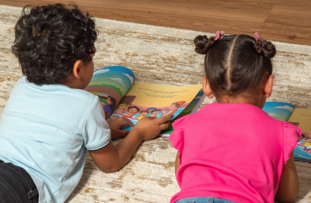
Children’s books require a strong balance between text and illustrations. Font size is larger, line spacing is wider, and text placement must avoid overlapping important visual elements. Page turns are also planned carefully to enhance storytelling and anticipation.
-
Picture books depend on page-by-page visual flow. Each spread (left and right page together) is treated as a single design unit, and text is often minimal, requiring precise placement to maintain clarity and emotional impact.
-
Early reader and chapter books need controlled vocabulary presentation. Short paragraphs, increased spacing, and clear font choices improve readability and comprehension for developing readers.
-
Novels prioritize uninterrupted reading flow. This includes consistent paragraph indentation, controlled hyphenation, proper justification, and careful handling of widows and orphans to maintain visual balance across pages.
-
Dialogue-heavy fiction requires proper indentation and spacing to clearly separate speakers. Poor dialogue formatting can confuse readers and disrupt pacing.
-
Non-fiction books rely heavily on structure. Headings, subheadings, bullet points, and numbered lists must follow a consistent hierarchy so readers can scan and locate information quickly.
-
Instructional and educational books often include callout boxes, side notes, charts, and diagrams. These elements must be aligned properly so they do not interrupt the reading flow or overcrowd the page.
-
Workbooks and journals require functional layout design. Adequate writing space, consistent alignment of prompts, and durable spacing are critical for usability.
-
Cookbooks, manuals, and reference books require repeatable layout patterns. Readers expect consistency in how recipes, steps, or sections are presented across pages.
-
Poetry and artistic books require precise control over line breaks, spacing, and alignment. Even small formatting errors can change the meaning or rhythm of the content.
-
Genre expectations also influence trim size, margins, and typography. For example, a children’s picture book and a business guide cannot share the same layout structure without compromising usability.
-
Consistency within the genre is essential. Once a style is established, it must be followed throughout the entire book to maintain a professional and cohesive experience.
As experienced author illustrators and an established illustrator agent, we design layouts that are not only visually appealing but also functionally aligned with the genre, ensuring that readers can engage with the content naturally and effortlessly.
Print vs Digital Formatting: Key Differences
Formatting for print and digital platforms requires completely different approaches because each format behaves differently in real-world use, especially for non picture books . A layout that looks perfect in print can break, shift, or lose structure entirely on an e-reader if it is not specifically designed for digital formats.
To create a professional book, both versions must be treated as separate outputs, each optimized for how readers actually consume content.
| Aspect |
Print Books |
eBooks (Digital) |
| Layout Type |
Fixed layout with complete control over positioning |
Reflowable layout that adjusts automatically |
| Page Structure |
Static pages with fixed page numbers |
No fixed pages; content flows based on screen and settings |
| Typography |
Designer controls fonts, spacing, and appearance |
Reader can change font type, size, and spacing |
| Line Breaks |
Manually controlled for visual balance |
Automatically adjusted, cannot be fixed |
| Images |
High-resolution with exact placement and bleed |
Flexible, must resize and reposition dynamically |
| Margins & Spacing |
Carefully set for print accuracy and binding |
Adjust automatically depending on device |
| Headers & Footers |
Used for navigation and page information |
Mostly removed; replaced by device UI |
| Navigation |
Linear reading experience |
Interactive navigation with links and TOC |
| Complex Layouts |
Supports columns, sidebars, precise layouts |
Limited support; layouts must be simplified |
| File Format |
Print-ready PDF with bleed and crop settings |
EPUB or Kindle formats requiring clean structure |
| User Control |
No control; fixed design |
High control over reading experience |
| Consistency |
Same layout for every reader |
Varies across devices and settings |
-
Page breaks in print are strategically placed to control pacing, while in eBooks they are fluid. This means scenes, chapters, and sections must be structured to work without relying on exact page positioning.
-
Widows, orphans, and visual balance can be perfectly controlled in print, but in digital formats they may appear differently depending on screen size and font adjustments.
-
Full-bleed designs, double-page spreads, and exact image alignment work well in print but are often not supported or require alternative layouts in eBooks.
-
Text wrapping around images is controlled in print but can break or behave unpredictably in digital formats, requiring simpler placement strategies.
-
Tables, charts, and complex visual elements may need to be redesigned for digital to ensure they remain readable on smaller screens.
-
Interactive elements such as hyperlinks, clickable references, and navigation menus are a major advantage in eBooks but do not exist in print.
-
File size and performance matter in digital formats. Large images or heavy formatting can slow down loading or cause issues on certain devices.
-
Different platforms like Kindle, Apple Books, and others may render the same file differently, making testing across devices essential.
-
Print requires technical settings like bleed, trim marks, and CMYK color profiles, while digital focuses more on responsive structure and clean coding.
-
Converting a print file directly into an eBook usually leads to broken layouts, spacing issues, and poor readability. Each version must be formatted separately.
Common Book Formatting Mistakes to Avoid
Many first-time authors underestimate how much formatting impacts the final quality of a book. Even small mistakes can make a book feel unprofessional, reduce readability, and negatively affect reader reviews. Most of these issues are avoidable with proper understanding and attention to detail.
Identifying and fixing these common formatting mistakes before publication can significantly improve the overall reading experience and credibility of your book.
-
Inconsistent fonts, sizes, and styles across chapters create a disjointed reading experience. Switching between different font types or heading styles without a clear system makes the book look unpolished.
-
Incorrect margins and gutter spacing can cause text to appear too close to the edges or disappear into the binding. This is especially problematic in print books and affects readability.
-
Ignoring bleed settings in print files can result in unwanted white borders around images or important visual elements being cut off during trimming.
-
Using low-resolution images leads to blurry or pixelated visuals in print. Images that look fine on screen may not meet the required print quality standards.
-
Overcrowded pages with too much text or too many visuals reduce readability. Lack of white space makes pages feel heavy and difficult to navigate.
-
Improper line spacing and paragraph spacing can make text appear either cramped or disconnected, both of which negatively affect reading comfort.
-
Poor alignment, such as inconsistent justification or uneven spacing, creates a messy and unbalanced layout.
-
Widows and orphans, where single lines appear at the top or bottom of pages, disrupt visual flow and make the layout look unprofessional.
-
Inconsistent chapter formatting, including different heading placements or spacing, breaks the structure of the book and confuses readers.
-
Not optimizing formatting separately for print and digital formats can result in layout issues, especially when converting files directly.
-
Missing or poorly structured table of contents, especially in digital books, makes navigation difficult for readers.
-
Failing to proof the final formatted file often leaves unnoticed errors that only become visible after printing or publishing.
Working with professional book editing services and layout experts helps identify and eliminate these issues before publication, ensuring a clean, consistent, and reader-friendly final product.
Professional Book Layout vs DIY Formatting
While DIY formatting tools have made it easier for authors to publish their work, they often fall short when it comes to achieving a truly professional result. The difference between DIY and professional formatting is not just about appearance—it directly impacts readability, credibility, and how your book is perceived by readers and distributors.
Understanding these differences helps you decide whether to invest time in learning formatting yourself or rely on experts to deliver a polished final product.
| Aspect |
DIY Formatting |
Professional Book Layout |
| Design Flexibility |
Limited to templates |
Fully customized layout based on book and genre |
| Typography Control |
Basic font and spacing options |
Precise control over fonts, spacing, and hierarchy |
| Layout Quality |
May include spacing and alignment issues |
Clean, balanced, and industry-standard formatting |
| Handling Complex Content |
Difficult for images, tables, or illustrations |
Optimized for all content types including visuals |
| Print & eBook Optimization |
Often same file used for both |
Separate optimized files for print and digital |
| Error Handling |
Manual and often overlooked |
Professional correction of widows, orphans, spacing issues |
| Time Investment |
High learning curve and time-consuming |
Saves time with expert execution |
| Industry Standards |
May not meet publishing requirements |
Aligned with print and platform standards |
| Reader Experience |
Can feel inconsistent or amateur |
Smooth, polished, and easy to read |
| Impact on Reviews |
Formatting issues may lead to negative feedback |
Better readability improves reader satisfaction |
| Support & Revisions |
Limited or none |
Professional support and revision options |
-
DIY tools rely heavily on templates, which can make books look generic and limit creative control.
-
Professional formatting ensures every element is aligned with the book’s genre, audience, and publishing goals.
-
Experts handle technical details that are often missed in DIY formatting, improving overall quality.
-
Custom formatting becomes essential for illustrated books, children’s books, and non-fiction with complex layouts.
-
Investing in professional layout reduces the risk of costly errors and rework after publishing.
When evaluating how much does it cost to publish a book, it is important to consider the long-term value of professional formatting. A well-formatted book not only improves readability but also strengthens your credibility and brand as an author, helping your work stand out in a competitive market.
Final Checklist Before Publishing Your Book
Before you publish book on Amazon or finalize your manuscript, it is essential to review every detail carefully. A well-prepared book not only looks professional but also avoids costly revisions after publishing.
- Ensure consistent typography, font sizes, and spacing throughout the book
- Verify correct trim size, margins, gutter space, and bleed settings for print
- Check that all images and illustrations are high resolution (300 DPI for print)
- Maintain proper chapter structure with consistent headings and page breaks
- Proofread the manuscript to eliminate grammar, spelling, and formatting errors
- Confirm alignment, paragraph spacing, and indentation are uniform
- Test your file on different devices (desktop, tablet, Kindle) for readability
- Include front matter and back matter (title page, copyright, acknowledgments, etc.)
- Ensure table of contents and navigation links are working correctly for eBooks
- Export final files in correct formats (PDF for print, EPUB/MOBI for digital)
Conclusion: Creating Layouts That Readers Truly Enjoy
Interior formatting is where storytelling and design come together to shape the reader’s experience. A thoughtfully designed layout improves readability, maintains pacing, and helps readers stay fully immersed in the story. Poor formatting, on the other hand, creates distractions that can reduce engagement and impact reviews.
Whether you are planning Amazon publishing, exploring self publishing companies Amazon, or working with professional designers, investing in high-quality formatting ensures your book meets industry standards. From clean typography to balanced page layouts, every detail contributes to how readers perceive your work.
A well-formatted book does more than present content—it builds credibility, enhances storytelling, and increases the chances of long-term success in a competitive publishing market.
How Blueberry Illustrations Creates Reader-Friendly Layouts
Blueberry Illustrations is not just an illustration agency—we act as a complete creative and publishing partner for authors. As one of the trusted book illustration companies and illustration firms, we combine design expertise with storytelling understanding to create books that truly connect with readers.
- Custom interior layouts designed according to your story, audience, and genre
- Seamless integration of text and illustrations for visual storytelling
- Professional formatting tailored for both print and Kindle publishing
- Expert guidance for authors learning how to publish children's story books
- Consistent design approach across cover, interior, and illustrations
- Attention to readability, spacing, and visual balance on every page
- End-to-end book publishing services from concept to final delivery
With the right combination of creativity and technical precision, your book becomes more than just a collection of pages—it becomes a meaningful experience that readers remember and recommend.
To explore more self publishing tips and resources that can guide you in writing, designing, and publishing your book, click on this link.
Click here to visit our Home Page.
Click here to view the portfolio of children’s book illustrations by Blueberry Illustrations:
https://blueberryillustrations.com/childrens-book-illustrationsClick here to explore affordable publishing packages offered by Blueberry Illustrations:
https://blueberryillustrations.com/affordable-publishing-packagesClick here to read author testimonials and reviews of Blueberry Illustrations:
https://blueberryillustrations.com/book-reviewClick here to view the Amazon book store featuring books published by Blueberry Illustrations:
https://blueberryillustrations.com/book-storeClick here to watch videos showcasing Blueberry Illustrations’ publishing and illustration work:
https://blueberryillustrations.com/videos